work by Daniil Chebotarev
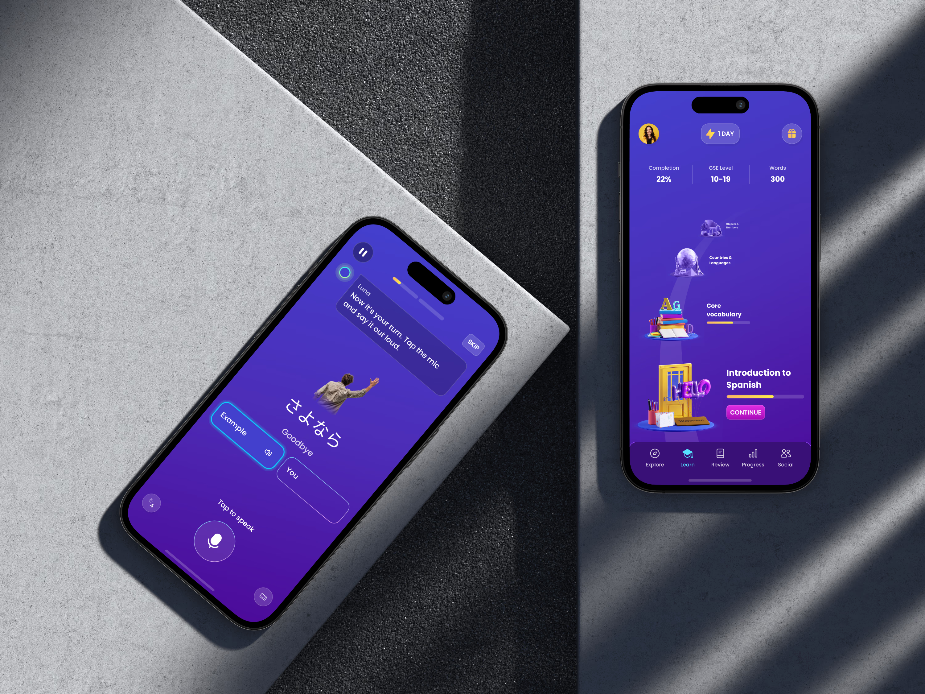
Mondly product screens

Redesigning Mondly, a 140M+ download language app

// Duration2023-2025
// ResponsibilitiesSole designer / design leadUser researchProduct strategyDesign system
// Team~40 engineersScaled design team from 1 to 5

//context

Sole designer turned design lead on Mondly's mobile redesign. I rebuilt the learning experience, stood up the design system and research practice, scaled the team 1 to 5, and moved every core metric for 1M+ monthly learners.

Mondly: a language app with 1M+ monthly users, a dated interface, no design system, no research. Pearson acquired it; I joined to modernize iOS and Android.

The redesign concept existed, but its designer left after a two-month handover. For nearly a year I was the only designer with ~40 engineers, owning flows, edge cases, research, and production quality.

Then I scaled the team from 1 to 5 (all my hires) and built the design system, research process, and QA standards the product still runs on. It shipped to every user and moved every core metric.

//impact

Monthly active users

1M+

Lesson completion rate

+18%

Conversion rate

+32%

Category completion rate

+100%

Design team scaled

1→5

Quiz types modernized

25+

Quiz completion post-redesign

>20%

Old Mondly

Redesign

Mondly redesign
Old Mondly app

//Learning Experience Leadership

After launch I led Mondly's B2C learning experience: quizzes, pronunciation, vocabulary, and the course map. A/B testing drove a double-digit lift in lesson completion.

We hardened 25+ quiz types for small screens, low-end devices, and right-to-left scripts like Arabic. Motion, haptics, and audio cues guided learners through lessons as interface, not decoration.

Flashcard feature

Flashcard feature

Spaced-repetition flashcards to revisit lesson content after each lesson.

Listen and repeat exercise

listen & repeat exercise

Audio-first pronunciation: hear, repeat, get guidance before testing. Fixes the complaint that lessons jumped straight to assessment.

Course map

course map

An interactive course map that makes progression feel tactile. A standout in reviews and user feedback.

RTL support

RTL support

Guidelines for right-to-left scripts across 30+ languages.

Lesson review

Layered Lottie animations create a playful review moment with the globe mascot.

AI conversation

AI conversation

Concept: mission-based conversation practice. Learners reply to AI prompts, get suggested phrases when stuck, and pick formal or informal tone.

//Vocabulary Review

My squad built Vocabulary Review, Mondly's most-requested feature, on a lean release path. V1 let learners save words from lessons into a basic folder.

Each quarter we added more, from in-lesson saving to custom collections, tracking whether people kept using it. Engagement and discoverability have both grown triple digits since launch.

Vocabulary review MVP

MVP

Deliberately minimal V1: review a lesson's words and drop them into one basic folder. Lean shipping validated demand before we invested deeper.

In-lesson save to collection

In-lesson save to collection feature

Saving moved into the lesson itself, so learners keep a word the moment they meet it. Lifted discoverability and saved volume.

Custom collections

custom collections

Concept: custom collections that turn a flat saved list into named, personal study sets.

What made the redesign work

//research

Not a visual refresh. I put research back into the process: a 20,000-user survey of new and churned learners, 100+ interviews and usability tests, plus live feedback and data. That evidence shaped every screen.

//design system

Built the design-system foundation during production. Semantic tokens ship across the app (not yet a full component system). The goal wasn't a pretty library; it was faster builds, clearer designer-dev handoff, and a consistent surface across iOS and Android.

//Interactions & motion design

My motion background shaped how the app feels. I treated onboarding, lessons, and review as connected sequences, using 3D moments, haptics, audio, and small transitions for momentum without noise.

//challenges of tech debt

The hardest part: shipping a modern experience through a legacy codebase. Slow cycles, platform gaps, and accessibility limits forced ruthless prioritization. Keep the model familiar, fix the worst usability issues first, build foundations that outlast launch.